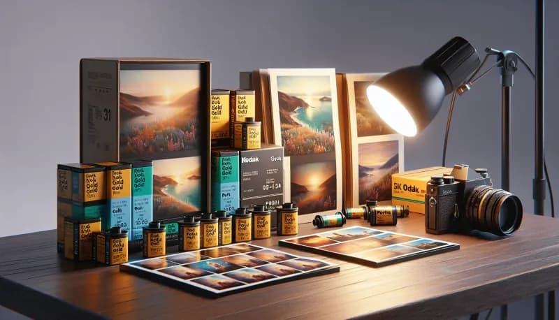
Kodak Gold vs Portra: The Complete Comparison Guide for Every Budget and Style
Quick Summary
Kodak Gold delivers a warm, saturated look at one-third the price of Portra In our experience developing thousands of rolls of both at Kubus Photo Service, Portra offers neutral colors, superior skin tones, finer grain, and much greater exposure latitude (3+ stops of forgiveness versus 1-2 for Gold). The reality is that both films have their place. Choose Gold for casual shooting, learning, and when you want that warm nostalgic aesthetic. Choose Portra for portraits, professional work, and when latitude and consistency matter most.
- Gold 200: Warmer, more saturated colors with obvious grain character
- Portra 400: Neutral skin tones, fine grain, exceptional latitude
- Gold requires more careful exposure; Portra forgives 2-3+ stops of error easily
- Gold's warm cast can be unflattering for some skin tones; Portra flatters virtually everyone
- For learning and casual work, Gold provides excellent value—shoot 3 rolls for the price of 1 Portra
- For portraits, weddings, and client work, we recommend investing in Portra for the reliability and quality
The price difference is stark: Kodak Gold costs a third of what Portra costs—and for photographers shooting regularly, this adds up to hundreds of dollars per year. The question every film photographer eventually asks is whether Portra's premium is justified or whether Gold is good enough.
We develop both films constantly at Kubus Photo Service and have seen thousands of rolls of each. Over the years, we've learned exactly when each film excels and when it falls short. This comparison covers the real differences, when each film excels, and how to choose based on your actual needs rather than marketing or reputation.
The Films at a Glance
Before diving deep, here's what we're comparing:
Kodak Gold 200
- Consumer film designed for general photography
- ISO 200 (also available as Gold 400 in some markets)
- Warm, saturated color palette
- Visible but pleasant grain structure
- Moderate exposure latitude (1-2 stops)
- Affordable consumer film
Kodak Portra 400
- Professional film designed for portrait photography
- ISO 400 (family includes 160 and 800)
- Neutral, balanced color palette
- Very fine grain for ISO 400
- Exceptional exposure latitude (3-5 stops)
- Affordable consumer film
The per-frame cost difference: between Gold and Portra. Over 100 rolls per year, that's a difference of over .
Quick Comparison Table
Price (Kodak Gold 200: Budget-friendly) — Kodak Portra 400: Premium
Cost efficiency (Kodak Gold 200: Lower per-image cost) — Kodak Portra 400: Higher per-image cost
ISO (Kodak Gold 200: 200) — Kodak Portra 400: 400
Color palette (Kodak Gold 200: Warm, saturated) — Kodak Portra 400: Neutral, balanced
Grain (Kodak Gold 200: Visible, characterful) — Kodak Portra 400: Fine, smooth
Exposure latitude (Kodak Gold 200: 1-2 stops) — Kodak Portra 400: 3-5 stops
Skin tones (Kodak Gold 200: Can shift warm/orange) — Kodak Portra 400: Consistently flattering
Best for (Kodak Gold 200: Casual, travel, learning) — Kodak Portra 400: Portraits, professional work
Detailed Feature Comparison
Price Kodak Gold 200: Affordable — Kodak Portra 400: Premium price, Winner: Gold
Speed flexibility Kodak Gold 200: ISO 200 only — Kodak Portra 400: ISO 400 (more versatile), Winner: Portra
Indoor shooting (Kodak Gold 200: Struggles in low light) — Kodak Portra 400: Handles low light well, Winner: Portra
Skin tone accuracy (Kodak Gold 200: Shifts warm/orange) — Kodak Portra 400: Natural and accurate, Winner: Portra
Landscape colors (Kodak Gold 200: Saturated, punchy) — Kodak Portra 400: Accurate, subtle, Winner: Preference
Grain structure (Kodak Gold 200: Visible, clumpy) — Kodak Portra 400: Fine, smooth, Winner: Portra
Large print quality (Kodak Gold 200: Good to 8x10) — Kodak Portra 400: Excellent to 16x20+, Winner: Portra
Exposure forgiveness Kodak Gold 200: 1-2 stops — Kodak Portra 400: 3-5 stops, Winner: Portra
Batch consistency (Kodak Gold 200: Variable) — Kodak Portra 400: Very consistent, Winner: Portra
Learning friendly (Kodak Gold 200: Requires accuracy) — Kodak Portra 400: Forgives mistakes, Winner: Portra
Color Science: Warm vs. Neutral
The most immediately visible difference between these films is their color rendering. How do these differences show up in real photographs? Have you ever wondered why your Gold shots look so different from Portra?
Kodak Gold's Warm Palette
Gold produces distinctly warm images with boosted saturation. Reds, yellows, and oranges sing. Greens tend toward yellow-green. Blues are present but take a back seat to warm tones.
This warmth isn't subtle—it's immediately recognizable. Gold adds an immediate nostalgic quality that many photographers love. Summer sunlight looks golden. Skin tones glow with warmth. Fall foliage pops.
The warmth can become problematic in certain situations:
- Already warm lighting (tungsten, golden hour) can become overwhelmingly orange
- Some skin tones, particularly those with already warm undertones, can shift toward orange or red
- Cool subjects (winter scenes, blue-toned architecture) may not render as intended
- White balance correction in scanning can only do so much
Gold's saturation is also notable. Colors are punchy and vibrant. This snapshooter-friendly rendering ensures casual photographs look lively without any post-processing. For social media and small prints, this immediate impact works well.
Portra's Neutral Approach
Portra delivers color that's closer to what your eyes see. The balance is neutral to very slightly warm. Saturation is restrained rather than boosted.
Skin tones are Portra's signature strength. We recommend Portra specifically for portrait work because the film renders all complexions beautifully without unflattering color casts. Light skin doesn't go pink or orange. Dark skin maintains richness and natural variation. The film was literally designed around getting skin right.
This neutrality extends to all subjects:
- Accurate reds that don't shift toward orange
- Clean, realistic blues and greens
- Natural white balance under varied lighting
- Subtle color relationships preserved
Some photographers find Portra muted compared to punchier films. The lack of obvious saturation can read as flat if you're expecting Instagram-ready vibrance. Portra often benefits from thoughtful color grading to add personal style.
Side-by-Side Color Comparison
Photographing the same scene on both films reveals consistent patterns:
- Portraits: Gold adds warmth that can flatter some subjects but overwhelm others. Portra renders skin naturally with appropriate warmth.
- Landscapes: Gold saturates greens toward yellow and punches up warm tones. Portra shows more accurate foliage with balanced color.
- Urban scenes: Gold adds nostalgic warmth to cityscapes. Portra documents scenes more accurately.
- Blue hour/shade: Gold may struggle with the cool tones. Portra renders them cleanly.
- Golden hour: Both films handle warm light well, though Gold may become excessively warm.
Grain Structure: Character vs. Smoothness
Grain is where technical differences become most apparent. Can you actually see the difference? The reality is that you definitely can, especially in larger prints.
Gold's Visible Grain
Kodak Gold shows obvious grain, especially in shadow areas and uniform surfaces like skin or sky. The grain is clumpy rather than tight, with visible structure even in modest enlargements.
At small sizes (4x6 prints, phone viewing), Gold's grain isn't problematic. At larger sizes (11x14 prints, detailed crops), grain dominates smooth areas.
Some photographers love this grain character. It's unmistakably film, adding texture and atmosphere. The grain screams authenticity in an age of digitally simulated film looks.
Others find the grain distracting. For portraits where smooth skin matters, Gold's grain can be unflattering. For anything requiring fine detail, the grain competes with subject detail.
Portra's Fine Grain
Portra 400's grain is remarkably fine for an ISO 400 film. The grain pattern is tight and uniform, visible only at significant enlargement. Many photographers find Portra's grain finer than consumer ISO 100 films.
This smoothness enables:
- Large prints without obvious grain structure
- Significant cropping while maintaining quality
- Smooth skin rendering in portraits
- Detail preservation in fine textures
The grain is still present and provides appropriate sharpness, but it serves the image rather than dominating it.
The Speed Factor
Remember that Gold 200 is two-thirds of a stop slower than Portra 400. Comparing their grain directly isn't entirely fair—Gold 200 vs Portra 160 or Gold 400 vs Portra 400 would be more equivalent.
Gold 400 (available in some markets) shows more grain than Gold 200 while remaining less smooth than Portra 400. The professional film's grain advantage persists regardless of speed matching.
Mail-In Your Film From Anywhere
Ship your film to our Brooklyn lab and get professional scans delivered to your inbox. Free shipping on 4+ rolls.
Exposure Latitude: Forgiveness vs. Precision
Exposure latitude may be the most practically significant difference between these films. What actually happens when you miss your exposure? This is where Portra truly shines.
Gold's Moderate Latitude
Kodak Gold handles typical exposure errors but pushes back against significant deviations:
Overexposure: Gold tolerates 1-2 stops of overexposure reasonably well. Highlights compress faster than Portra, losing detail sooner. Heavy overexposure produces washed-out, muddy images.
Underexposure: Gold struggles with underexposure. Even one stop under produces shadow noise and grain increase. Two stops under shows significant quality loss with muddy shadows.
For Gold to perform its best, exposure needs to be reasonably accurate. Metering errors of more than a stop begin affecting image quality visibly. A common mistake we see is photographers shooting Gold like they'd shoot Portra—that just won't work.
Portra's Exceptional Latitude
Portra 400's latitude is legendary and well-deserved:
Overexposure: The film handles 3, 4, even 5 stops of overexposure with recoverable results. Highlights roll off gracefully. Many photographers deliberately overexpose Portra by 1-2 stops for an airy, bright aesthetic.
Underexposure: Portra tolerates 1-2 stops underexposure well. Shadow detail compresses but remains recoverable. The film loses less quality to underexposure than most negative films.
The reality is this latitude provides insurance. Missed meter readings, changing light, and high-contrast scenes don't ruin shots. Wedding photographers especially appreciate knowing that exposures across diverse conditions will produce usable images.
Exposure Latitude Comparison
-2 stops (Kodak Gold: Significant quality loss, muddy shadows) — Portra 400: Shadow compression, still usable
-1 stop (Kodak Gold: Noticeable grain increase) — Portra 400: Minimal visible impact
Correct (Kodak Gold: Optimal results) — Portra 400: Optimal results
+1 stop (Kodak Gold: Good results) — Portra 400: Excellent, some prefer this
+2 stops (Kodak Gold: Highlight compression begins) — Portra 400: Still excellent
+3 stops (Kodak Gold: Washed out, lost detail) — Portra 400: Good results, pastel tones
+4 stops (Kodak Gold: Not recommended) — Portra 400: Still recoverable
Practical Implications
The latitude difference affects how you shoot:
With Gold: Meter carefully. Check exposures when conditions change. Be conservative with subjects you can't reshoot. Accept that some challenging-light images may not work.
With Portra: Meter normally but don't stress about precision. Expose for shadows and trust the highlights. Shoot confidently in mixed or changing light.
For beginners still developing metering skills, Portra forgives the learning curve. For experienced photographers who meter accurately, Gold's latitude may suffice.
Real-World Performance Comparisons
Abstract specifications only tell part of the story. Here's how each film performs in common situations. Where does each film shine?
Outdoor Daylight
Both films excel in standard outdoor conditions with ISO 200 or 400 providing appropriate speed for typical apertures and shutter speeds.
- Gold produces warmer, more saturated images with a summery quality. Blues may render less vibrantly. Grain becomes visible in clear sky areas.
- Portra produces accurate, balanced images. Colors feel natural. Grain remains invisible in typical sky exposures.
Portraits in Natural Light
This scenario reveals the films' core differences clearly. In our experience, this is where film choice matters most.
- Gold's warmth affects skin tones significantly. Light skin picks up golden or peachy tones. Some complexions photograph beautifully; others shift toward unflattering orange-red.
- Portra renders skin accurately across all complexions. The film's design explicitly prioritizes flattering skin reproduction. A common mistake is choosing Gold for portraits and ending up with overly orange skin.
Indoor Available Light
ISO 200 (Gold) vs. ISO 400 (Portra) matters here. Gold requires wider apertures or slower shutter speeds, potentially pushing into problematic territory.
- Gold's warmth often complements tungsten-lit interiors, matching the ambient warmth. However, mixed lighting (windows plus lamps) can become excessively orange in warm areas.
- Portra's extra stop of speed enables more comfortable handheld shooting. The neutral balance handles mixed lighting without extreme color shifts.
Overcast or Shade
Cool lighting conditions test Gold's warm bias. What happens when you shoot Gold in the shade?
- Gold can look pleasant in overcast light, adding warmth that compensates for cool conditions. Or it can look odd, fighting the ambient color rather than complementing it.
- Portra renders cool light accurately. Shaded scenes read as appropriately cool. The neutrality documents the scene's actual color.
Golden Hour and Sunset
Both films handle warm light well, though differently.
- Gold accentuates warm tones, sometimes to the point of overwhelming orange. Beautiful when the warmth suits the image; too much when subtlety is desired.
- Portra renders warm light accurately without excessive saturation. The warmth is present but controlled. Golden hour looks golden without turning orange.
Flash Photography
Daylight-balanced flash pairs well with both films.
- Gold adds its characteristic warmth to flash-lit subjects. Fill flash in outdoor portraits produces warm skin against cooler ambient backgrounds.
- Portra renders flash-lit subjects neutrally. Studio or event photographers relying on flash often prefer Portra's predictability.
Cost Analysis: When Price Matters
The economic reality affects most photographers' decisions. Let's break down the actual costs. Is the price difference really worth it?
Per-Roll Economics
At current 2026 prices:
-
Gold 200 (36 exp): affordable
-
Portra 400 (36 exp): premium
-
Gold:
-
Portra:
Add processing and scanning through our film developing and scanning service (approximately per roll):
- With processing, (Gold) vs. .92 (Portra)
Annual Volume Calculations
For a photographer shooting 50 rolls per year:
- Gold: Lower film cost + processing = Lower total
- Portra: Higher film cost + processing = Lower total
- Difference: Hundreds of dollars per year
For a photographer shooting 100 rolls per year:
- Gold: Lower film cost + ,500 processing = Lower total
- Portra: ,800 film + ,500 processing = Lower total
- Difference: Hundreds of dollars per year
The processing cost equalizes somewhat, but film cost differences remain substantial.
When Gold's Price Advantage Wins
- Learning photography fundamentals
- Casual everyday documentation
- High-volume personal projects
- When the warm aesthetic matches your vision
- Travel photography where you'll shoot heavily
- Any situation where the budget constrains volume
When Portra's Quality Justifies the Cost
- Professional client work
- Important personal events (weddings, milestones)
- Portraits where skin rendering matters
- Challenging lighting where latitude is essential
- Large prints where grain matters
- Any images you'd be devastated to lose to exposure error
Mixing Films: A Practical Approach
Many photographers use both films strategically. We've seen this work exceptionally well for photographers who think carefully about their film choices.
The Portfolio Approach
Keep Gold for:
- Daily shooting and practice
- Street photography and candids
- Travel documentation and snapshots
- Any project embracing the warm aesthetic
Save Portra for:
- Planned portrait sessions
- Events with importance
- Situations requiring reliability
- Work for clients or others
This approach balances cost and quality. Shoot ten rolls of Gold for every roll of Portra and dramatically reduce annual film costs while maintaining quality when it matters.
Matching Film to Subject
Some subjects suit Gold's characteristics:
- Summer activities and beach scenes
- Warm-toned environments
- Nostalgic or vintage themes
- Scenes where saturation adds energy
Some subjects demand Portra's precision:
- Formal portraits of any kind
- Documentation requiring accuracy
- Subjects with critical color (products, art)
- Cool-toned subjects that would fight Gold's warmth
Testing Both
If you're unsure which film suits your style, buy a roll of each and shoot them on the same subjects. Side-by-side results reveal preferences quickly. The investment in testing saves guesswork.
Processing and Scanning Considerations
Both films use standard C-41 processing, so development costs and times are identical. Scanning may differ slightly.
Color Correction
Gold's strong warmth requires more aggressive correction if you want neutral results. Some photographers embrace the warmth; others correct toward neutral. Communicate your preference to your lab—we're always happy to adjust our scanning approach.
Portra scans neutral with minimal correction. Its designed scanning compatibility means consistent results across different scanners and labs.
Grain Management
Gold's visible grain affects scanning choices. Heavy noise reduction can smear grain into an unnatural smoothness. Light noise reduction preserves grain character. Discuss approaches with your scanning lab.
Portra's fine grain rarely requires significant noise reduction. The grain provides natural sharpness without competing with image detail.
Lab Consistency
Professional films like Portra are manufactured with tighter tolerances and stored more carefully through distribution. Gold, as a consumer film, may show more batch-to-batch variation.
For critical work requiring consistency across multiple rolls, Portra provides more predictable results. For casual shooting, Gold's variation rarely causes problems.
Frequently Asked Questions
Is Portra worth three times the price of Gold?
For professional work, critical personal images, and any situation where quality and consistency matter most, yes. For learning, casual shooting, and high-volume personal projects, Gold provides excellent results at sustainable cost. Most photographers benefit from using both strategically.
Can I get Portra-like results from Gold with post-processing?
You can correct Gold's warmth toward neutral and potentially reduce grain visibility, but you can't add Portra's latitude, skin tone rendering, or smooth grain structure after the fact. The films' characteristics are baked in at capture.
Which film should beginners start with?
Gold. The lower cost enables shooting more, which accelerates learning. Gold's characteristics are forgiving of common beginner mistakes (improper color balance, exposure errors within its latitude). Graduate to Portra as your skills and needs evolve. This is what we recommend to everyone starting out.
Does Portra 160 provide better value than Portra 400?
Portra 160 costs similarly to Portra 400 but offers one stop less speed. It provides even finer grain when conditions allow the slower speed. Value depends on whether you need the speed—in good light, Portra 160 is excellent. In mixed conditions, Portra 400's versatility wins.
Is Gold 200 sharper than Portra 400 because of the lower speed?
No. Portra 400's grain structure is finer than Gold 200's despite the speed difference. The professional film's T-grain technology produces superior results regardless of ISO.
Can I push Gold 200 to ISO 400 to match Portra's speed?
You can rate Gold 200 at 400 and request +1 push processing. Results show increased grain and contrast. Some photographers like this look. It doesn't transform Gold into Portra—the color characteristics remain.
Which film handles flash better?
Both work well with daylight-balanced flash. Portra's neutral rendering may be preferable for accurate skin tones. Gold's warmth can create pleasant fill effects. Neither is objectively better for flash; it depends on desired aesthetic.
The Verdict: Different Tools for Different Jobs
Kodak Gold and Portra aren't competing for the same job. Gold is a consumer film delivering punchy, warm images at accessible prices. Portra is a professional tool providing precision, consistency, and quality for work that demands it.
Most film photographers benefit from having both in their bags. Use Gold freely and experimentally. Save Portra for images that matter most. Neither film is wrong—they're designed for different purposes and both accomplish their goals excellently.
Get Both Films Developed Right
Whether you're shooting Gold for everyday adventures or Portra for important portraits, proper development and scanning brings out each film's best qualities. At Kubus Photo Service, we handle both films daily and understand how to scan each for optimal results.
Our turnaround is typically 4-6 business days, with rush same or next day service when you need faster results. Ship your film through our mail-in film lab service or drop it off at our Greenpoint location.
Questions about which film suits your needs? Check out our film developing and scanning page for more details, or explore our mail-in film lab service to get started. We're always happy to discuss film selection and help you get the results you're looking for.
Kubus Photo Service has been developing film in Greenpoint, Brooklyn since 1994. We've seen the full range of what both Gold and Portra can do, and we're here to help you get great results with whichever film you choose.
Related Articles
Best Film for Beginners: The Honest Guide from 30 Years Behind the Counter
After developing film for beginners since 1994, we've seen every mistake and every triumph. Here's our no-nonsense guide to choosing your first film stocks, avoiding expensive pitfalls, and building a foundation that actually works.
Kodak Portra 400: The Complete Review and Why It Became the Professional Standard
Portra 400 earned its reputation through exceptional skin tones, remarkable exposure latitude, and fine grain that defies its speed. This in-depth review covers the technical characteristics, practical applications, and whether this professional film justifies its premium price.
How Much Does Film Developing Cost in 2026? Complete Price Guide
Film developing costs $12-25 per roll in 2026. Get the complete breakdown of drugstore vs. professional lab pricing for 35mm, 120, disposable cameras, and black and white film with honest advice on where to spend and where to save.
Ready to Develop Your Film?
We're a family-run film lab in Greenpoint, Brooklyn, developing film since 1994. Whether you drop off in store or mail your rolls from anywhere in the US, we treat every frame with care.
How to Mail In Film for Developing: Complete Step-by-Step Guide
Learn exactly how to safely mail your film for professional developing. Step-by-step guide covering packing, shipping options, what to expect, and how to get the best results from a professional film lab.
Read the Complete Guide